Drew Conway’s Data Science Venn Diagram is perhaps the most well-known description of data science.
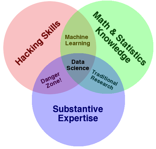
Drew published it more than five years ago. Since then, a ridiculous number of Venn diagrams have been created, one worse than the other.
Five years later, people still struggle with the definition of Data Science. A recent famous example was Lyft changing the titles of their Data Scientists, Data Analysts and Research Scientists.
Should we care?
There’s a lot of information asymmetry in the Data Science market, the position being so new, and “Michael Spence signaling” matters. Having a “Data Scientist” title from a reputable company is an important signal. For example, a medium-sized company might not be aware that Lyft recently changed their data analysts title to “Data Scientist”
Part of the problem is that the “Data Scientist” title is itself poorly defined, as shown by the litany of Venn and not-Venn diagrams listed above. A short, non-comprehensive list of alternative titles for Data Scientists I’ve met in the last month:
- Tableau/Power BI Report Designer
- Machine Learning Researcher
- Python Programmer who knows how to call scikit-learn functions
Using the same name for vastly different abilities makes matching between employers and employees difficult. In addition, it may make career progression difficult. For example, job responsibilities and objectives are likely to be related to a company’s interpretation of the title of “Data Scientist”. Employees in that company may be “Data Scientists” under other interpretations, and may be really good, but may have their performance evaluated under different guidelines: “I know your ML model saved $1B for our company, but the color scheme of your Tableau reports is horrible!” As per the (not really) Albert Einstein’s quote “(…) if you judge a fish by its ability to climb a tree, it will live its whole life believing that it is stupid.”
Conway’s Venn to the rescue!
Here’s where I think Conway’s Venn diagram comes to the rescue in a useful way. We could rule out the Tableau Designer if they lack programming or statistical skills. We could rule out the ML Researcher if they don’t have domain expertise. We could rule out the Python programmer if they don’t know Math and/or have domain expertise. Perhaps this makes Data Scientists hard to find (it would justify their salary)!
Depending what the company you work for was before the Data Science profession started, a lot of people from different jobs may have re-branded themselves as data scientists. I think Conway’s diagram is helpful as it points to where people should focus their development in order to be more effective as data scientists. For example, former Economists most likely need more hacking skills, former computer scientists need more Statistics and domain expertise, and former management/technical consultants likely need more Statistics.
It can also serve as a check for inclusiveness. For example, a team of former machine learning engineers is struggling to deliver meaningful projects because they lack domain expertise. However, they can’t hire domain experts because the domain experts keep failing the machine learning interviews. Comically, the machine learning engineers think that domain expertise “is easy”.

The most useful part of Conway’s diagram for me is that I’ve time and again observed projects that don’t have representatives that can communicate well with each other in all three areas to fail. Conway’s diagram even makes it easy to show how the project failed (“nobody with domain expertise”, “missing knowledge of statistics”). Having a single person that can do all three is difficult, but it certainly solves the communication problem. That being hard or impossible, having specialists that can communicate with each other will usually be sufficient.
But Conway’s Venn is missing something!!!
True to the famous Box aphorism that “all models are wrong but some are useful”, Conway’s Venn is not perfect. In my experience, one of the things that I usually miss is “intensity”. Someone that knows how to write a “Hello World!”, knows how to take averages, and know how to calculate compound interest has knowledge in all three areas of the Venn diagram, but is probably not the ideal person to lead a data science project in Finance. Conway’s is best used to tell you what’s missing for career development, for a team, for a project, but it will not solve all problems.
It will, however, solve many problems that matter, and will provide useful information very elegantly. You can’t ask much more from a model.